072e. Pie Charts and Divided Bar Graphs
Learning Intentions
- To understand that pie charts and divided bar graphs are used to represent proportions of a total
- Draw and Interpret a pie chart
- draw and interpret a divided bar Draw
Pre-requisite Summary
- Understand that a proportion compares a part to a whole
- Know that fractions, decimals and percentages can represent proportions
- Be able to Solve a fraction or percentage of a total
- Understand that a full circle represents a whole, or
- Know that a full angle around a point is
- Be able to label categories and frequencies clearly
- Understand that equal totals are important when comparing proportions in divided bar graphs
- Be able to Use a ruler and protractor accurately when constructing graphs
Worked Examples
Worked Example 1
a) Explain why pie charts and divided bar graphs are useful for showing proportions of a total.
b) State what the whole represents in a pie chart.
c) State what the whole represents in a divided bar graph.
Worked Example 2
A class survey gives:
- Sport:
- Music:
- Art:
a) Draw a pie chart. b) Label each sector. c) State which category has the greatest proportion.
Worked Example 3
A group of
- bus:
- car:
- walk:
a) Convert each category to a proportion of the total. b) Draw a divided bar graph. c) Interpret the graph.
Worked Example 4
A pie chart shows the proportions of favourite fruits:
- apples:
- bananas:
- oranges:
a) Convert each fraction to an angle. b) Draw the pie chart. c) Explain how the sector sizes show the proportions.
Worked Example 5
A divided bar graph shows the proportions of water use in a house:
- bathroom:
- kitchen:
- garden:
a) Draw the divided bar graph. b) Label each section. c) State which section is the smallest.
Worked Example 6
A pie chart or divided bar graph is given.
a) Read the largest category.
b) Read the smallest category.
c) Estimate a proportion for one category.
Problems
Problem 1
a) Explain why pie charts and divided bar graphs are useful for showing proportions of a total.
b) State what the whole represents in a pie chart.
c) State what the whole represents in a divided bar graph.
Problem 2
A class survey gives:
- Reading:
- Gaming:
- Drawing:
a) Draw a pie chart. b) Label each sector. c) State which category has the greatest proportion.
Problem 3
A group of
- sandwich:
- pasta:
- sushi:
- salad:
a) Convert each category to a proportion of the total. b) Draw a divided bar graph. c) Interpret the graph.
Problem 4
A pie chart shows the proportions of pets owned:
- dogs:
- cats:
- fish:
a) Convert each fraction to an angle. b) Draw the pie chart. c) Explain how the sector sizes show the proportions.
Problem 5
A divided bar graph shows the proportions of time spent after school:
- homework:
- sport:
- screen time:
a) Draw the divided bar graph. b) Label each section. c) State which section is the largest.
Problem 6
A pie chart or divided bar graph is given.
a) Read the largest category.
b) Read the smallest category.
c) Estimate a proportion for one category.
Exercises
Understanding and Fluency
Exercise 1.
State whether each graph type shows proportions of a whole:
a) pie chart
b) divided bar graph
c) line graph
Exercise 2.
For each graph, state what represents the whole:
a) the full circle in a pie chart
b) the full bar in a divided bar graph
c) one sector in a pie chart
Exercise 3.
Convert each percentage to an angle for a pie chart:
a)
b)
c)
Exercise 4.
Convert each percentage to an angle for a pie chart:
a)
b)
c)
Exercise 5.
Draw a pie chart for:
a) red
b) blue
c) green
Exercise 6.
Draw a pie chart for:
a) football
b) basketball
c) tennis
Exercise 7.
Draw a divided bar graph for:
a) apples
b) bananas
c) oranges
Exercise 8.
Draw a divided bar graph for:
a) walking
b) bus
c) car
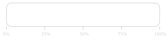
Exercise 9.
Interpret the graph by stating:
a) the largest category
b) the smallest category
c) one category that is about one-quarter of the total
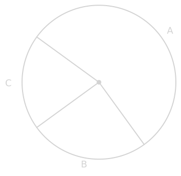
Exercise 10.
Interpret the graph by estimating:
a) a category that is about half the total
b) two categories that together make about
c) the difference in proportion between the largest and smallest categories
Reasoning
Exercise 11.
Explain why a pie chart is suitable for showing parts of a whole.
Exercise 12.
A student draws a pie chart but the sector angles add to
Exercise 13.
Explain why the full bar in a divided bar graph must represent the same total each time.
Exercise 14.
A student says the tallest section in a divided bar graph means the largest proportion. Explain why this is incorrect.
Exercise 15.
Explain why larger sectors in a pie chart represent larger proportions.
Exercise 16.
A student labels a pie chart but does not include a title. Explain why this makes interpretation harder.
Problem-solving
Exercise 17.
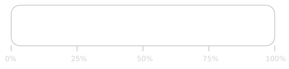
A survey of favourite pets gives: dogs
a) Find the total.
b) Draw a divided bar graph.
c) State which pet is chosen by the greatest proportion.
Exercise 18.
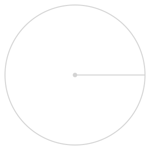
A class of
bus
a) Convert each category to a fraction or percentage of the total.
b) Draw a pie chart.
c) Interpret the chart.
Exercise 19.
A daily time-use survey gives: sleep
a) Express each part as a proportion of
b) Draw a divided bar graph.
c) State which two categories are equal.
Exercise 20.
A pie chart shows spending in a week:
food
travel
entertainment
savings
a) Draw the pie chart.
b) State the angle for food.
c) Identify the two equal categories.
Exercise 21.
A sports club survey gives: soccer
a) Draw a divided bar graph.
b) State the most popular sport.
c) Estimate how much more popular soccer is than tennis.
Exercise 22.
A pie chart is used to show favourite fruits in a class: apples
a) Draw the chart.
b) State the angle for bananas.
c) Explain why apples take the largest sector.
Potential Misunderstandings
- Students may think pie charts and divided bar graphs show frequencies directly rather than proportions of a total
- Students may forget that the whole pie chart must add to
- Students may forget that the full divided bar must represent the entire total, or
- Students may convert percentages to angles incorrectly
- Students may draw sectors that do not match the calculated proportions
- Students may compare the height of sections in a divided bar graph instead of the length of each section
- Students may label categories unclearly or forget to include a title
- Students may think the largest category in a pie chart must always be more than half, which is not true